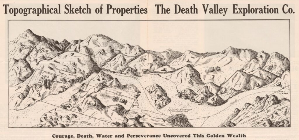
In 1929, the Death Valley Exploration Company made a grand announcement: after decades of searching, a potable water source had been discovered deep in California’s Mojave Desert that would finally allow for the establishment of a lucrative gold mine there.
A detailed topographical map of the area was published in a company brochure—complete with markings of trails and roads, illustrations of the surrounding mountains, and the locations of both the ore and the newly found stream—and the public was invited to buy shares.
“At first look, this might have seemed like a good investment, but actually the map was a total fraud,” explains cartography enthusiast P.J. Mode ’60, BME ’61. “Both the stream and the map were invented to sell stock in this phony gold mine.”
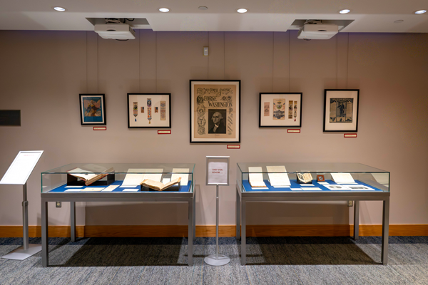
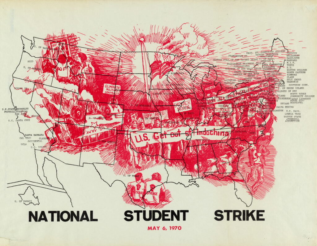
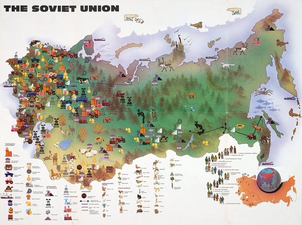
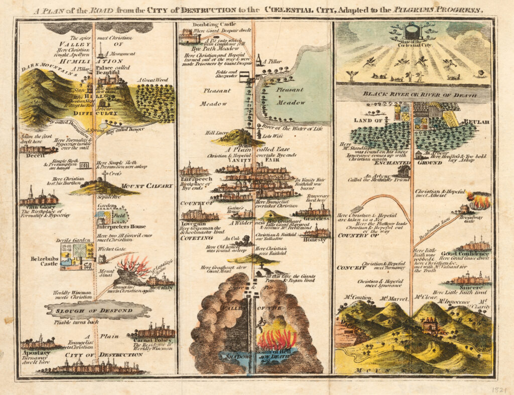
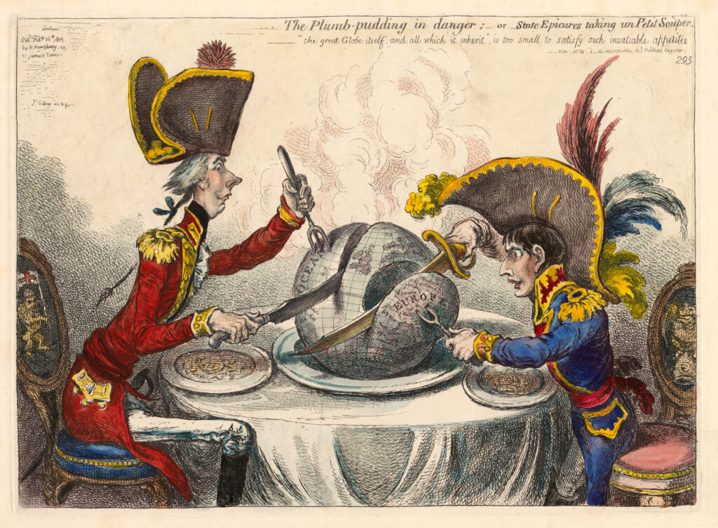
That vintage con job is just one of the nearly 1,400 maps, artwork, and other documents that make up Mode’s Collection of Persuasive Cartography, most of which is now housed in Cornell University Library’s Division of Rare and Manuscript Collections in Kroch Library.
About 10 years ago, after collecting for nearly four decades, Mode began donating the bulk of his maps to Cornell; since then, more than 1,200 have been scanned and made available online, with more to come.
(The physical maps can also be requested for in-person research in Kroch’s rare book reading room.)
According to Katherine Reagan, the Stern Curator of Rare Books & Manuscripts, it’s among the most consulted of all the University Library’s digitized collections, drawing about 1,000 unique visitors to the Kroch website each month.
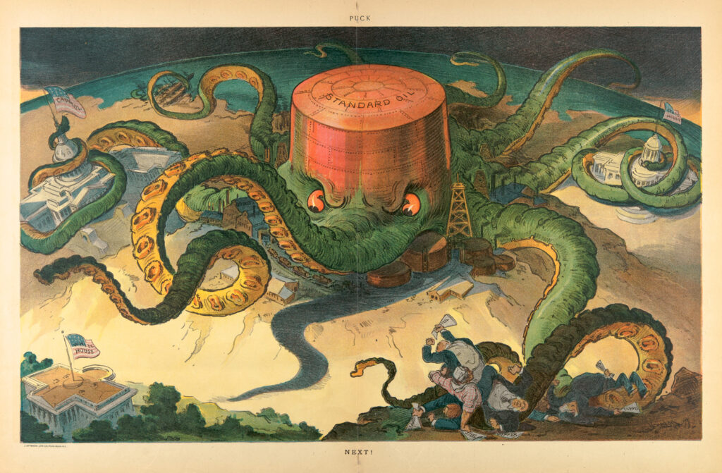
“The maps in his collection do not aim to present accurate geographical information,” Reagan says, “but rather to sway public opinion.”
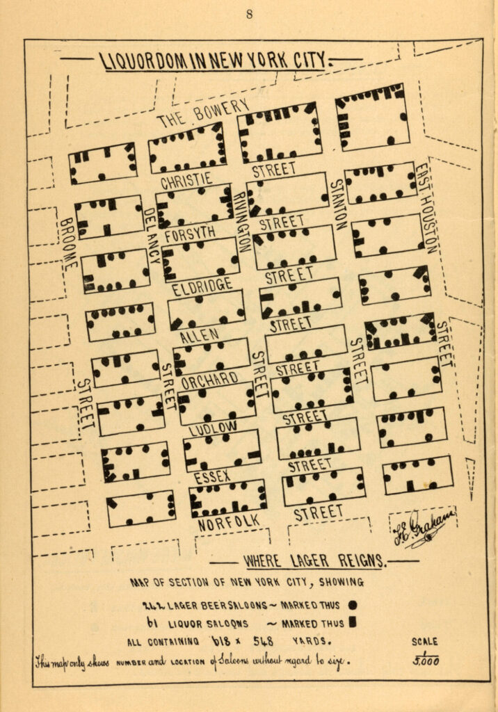
What makes a map persuasive? Mode—a retired attorney who lives in NYC—explains that cartographers employ a number of techniques, including the use of false or misleading data and the selective inclusion or exclusion of information.
Color also plays an important role; for example, red is often used to represent what the mapmaker wants to portray as banned, dangerous, or wrong.
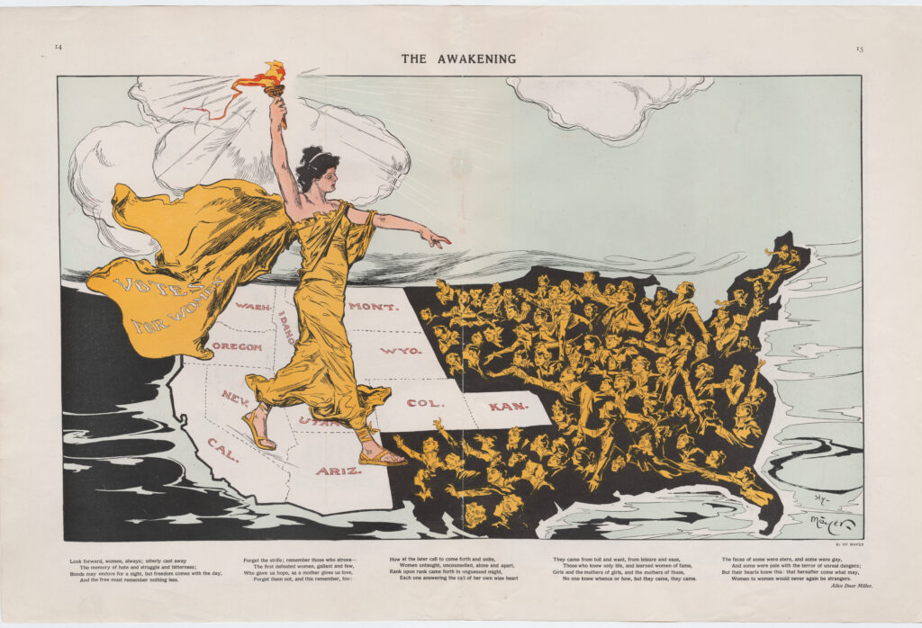
Emotions can be stirred through dramatic pictures or caricatures, such as Lady Liberty—dressed in gold, her cape bearing the words “VOTES FOR WOMEN”—marching across America in a map titled “The Awakening,” which was produced in support of the suffrage movement (and is seen at the top of this story).
The collection’s holdings date from the 1490s to the 2020s, originate from around the world, and represent 29 languages.
The maps, which University faculty have used for teaching and research, are divided into more than 30 categories—from advertising to alcohol, poverty to politics, romance to finance.
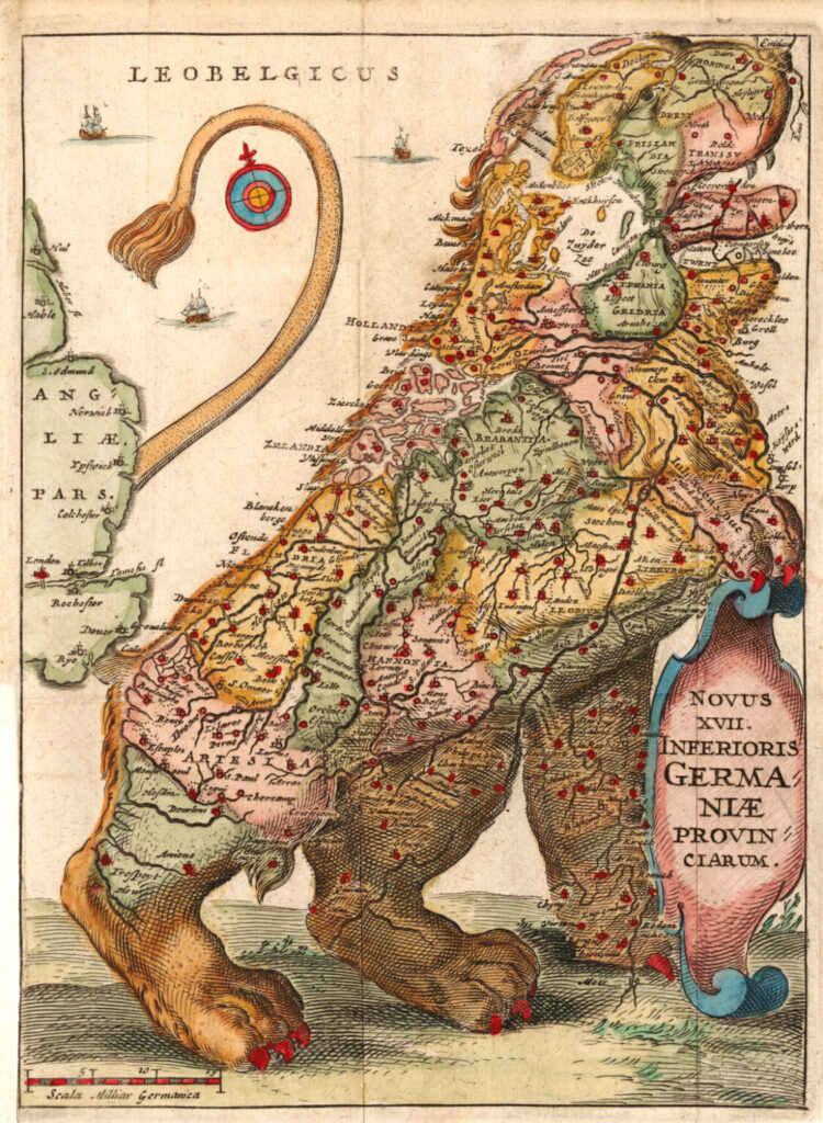
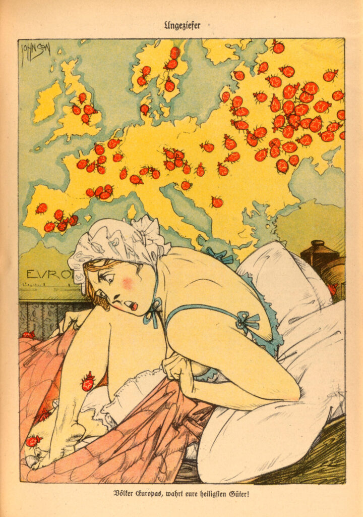
Many of the specimens from late 15th- and early 16th-century Europe—brimming with biblical symbols like the Garden of Eden and the devil—were designed to reinforce religious ideals in the widely illiterate population.
Nazi-produced maps from the ’30s and ’40s, inaccurately showing Allied battalions surrounding Germany, were intended to depict the nation as a victim defending itself—even though it was the aggressor in World War II.
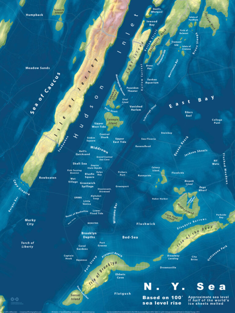
Decades later, a 2015 map warned of the dangers of climate change in semi-satirical fashion by showing the effects on the NYC metro area of a 100-foot rise in sea level, the approximate result of half the world’s ice sheets melting: nearly all of Manhattan, Brooklyn, and Queens are under water, and other locales bear labels like “Greenwich Spillage,” “Central Shark,” “Bed-Sea,” and “Flushed Meadows.”
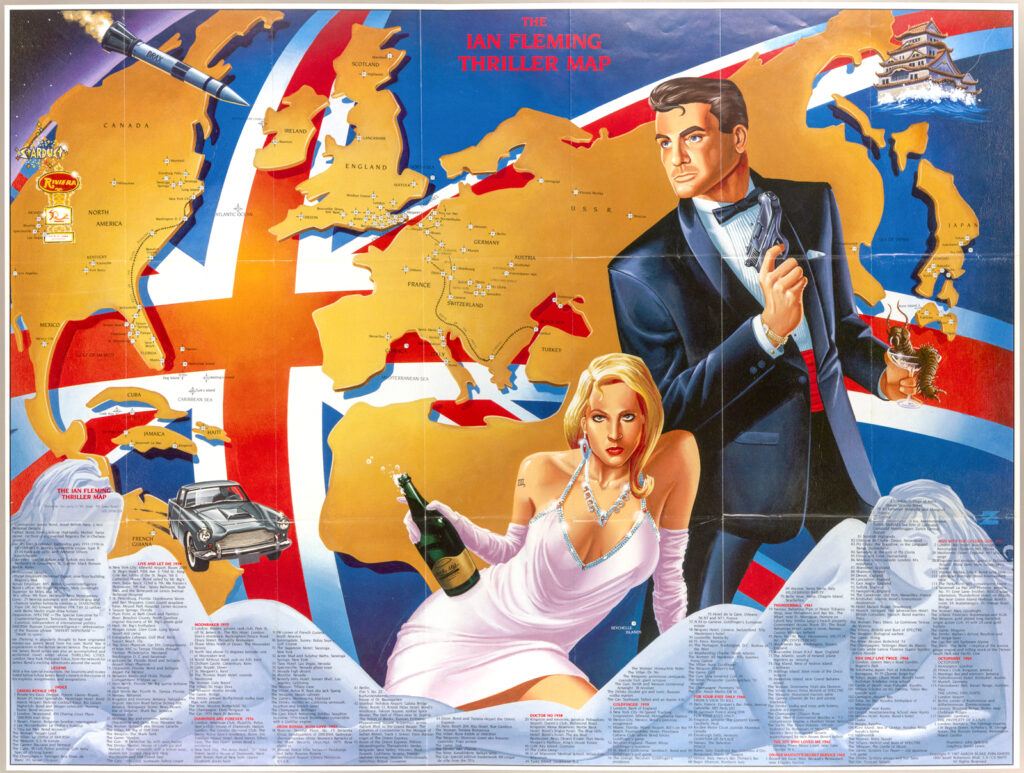
On a much more lighthearted note, an “Ian Fleming Thriller Map” from 1987 highlights the globe-trotting adventures of literary spy James Bond by detailing the locations of his derring-do in novels like Diamonds are Forever and You Only Live Twice—complete with images of an Aston Martin, the Union Jack, a bottle of Champagne, and (of course) some suggestively posed women.
Then there’s an example from the 1884 U.S. presidential election, titled “How the Public Domain Has Been Squandered.”
It was created by Democrats to spur outrage about the granting of public land to private companies to build the Transcontinental Railroad—but the actual amount of land that had been conferred by the Republican-led Congress was far less than what the map showed.
“It looks like 91% of the State of Iowa was given to corporations, when in reality it was 13%,” says Mode. “This map was used for 60 years to prove all sorts of things about corruption, Republicans, and capitalism. It was a terrifically powerful map—and it’s fake.”
For Mode, one of the most compelling aspects of persuasive maps lies in the tension between what they seem to be and what they actually are: while maps are generally presumed to be sources of objective information, persuasive ones are inherently biased.
“Almost every one of us has a recollection as a young child of getting in a car and watching an adult unfold a map and use it to get someplace that you’ve never been before,” Mode observes.
“People trust maps, so they can be very dangerous. It’s in our best interest to become more discerning consumers of cartographic information—to find out where the data came from and to be a little more skeptical.”
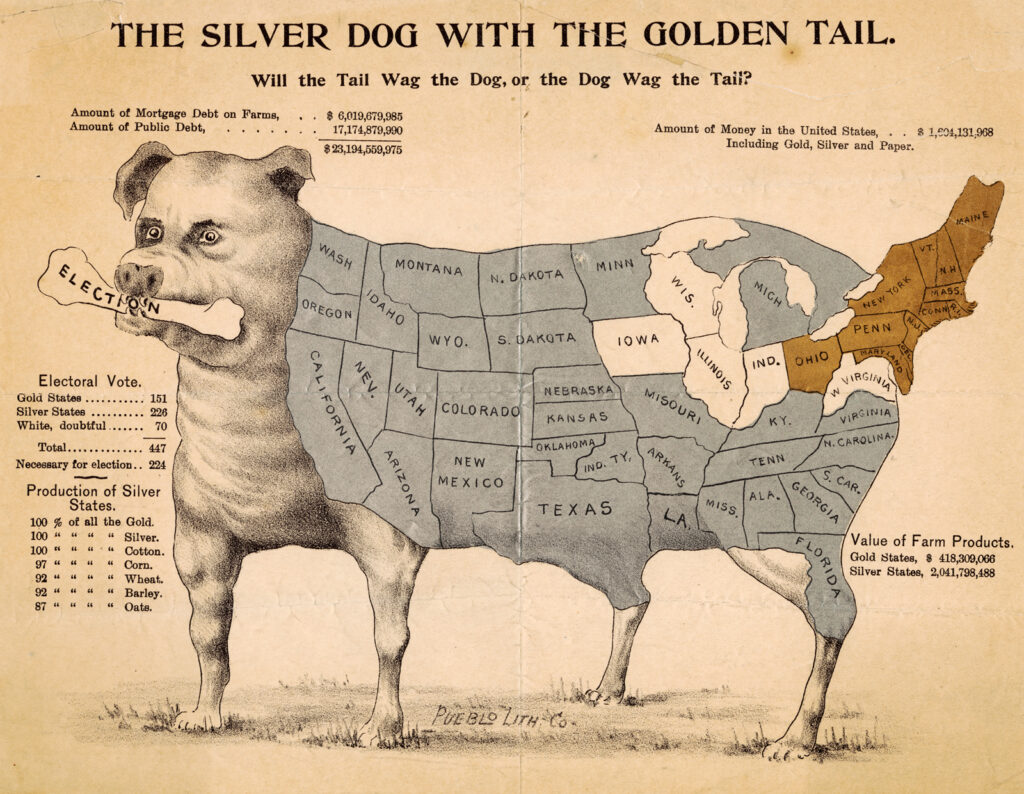
What in the World: A Sampling of Mode’s Maps
All map images courtesy of Cornell University Library’s Rare and Manuscript Collections. This story originally appeared in Cornellians.